Travel Blog Redesign Case Study: From Postcard to Field Notebook
Roaming Sparrow is my travel blog. I built it in 2019 to log stories from the road, and like most personal projects it got updated in small bursts between client work and never got the attention it deserved. This past week it finally got a full travel blog redesign — ground up. No client, no brief, no committee. Just me deciding what the site should actually be.
That freedom is why I’m writing it up. A redesign with no one to please but yourself is the cleanest possible look at how I make these calls — every choice had to earn its place against the idea, not against someone’s attachment to the old version.
What was wrong with the old design
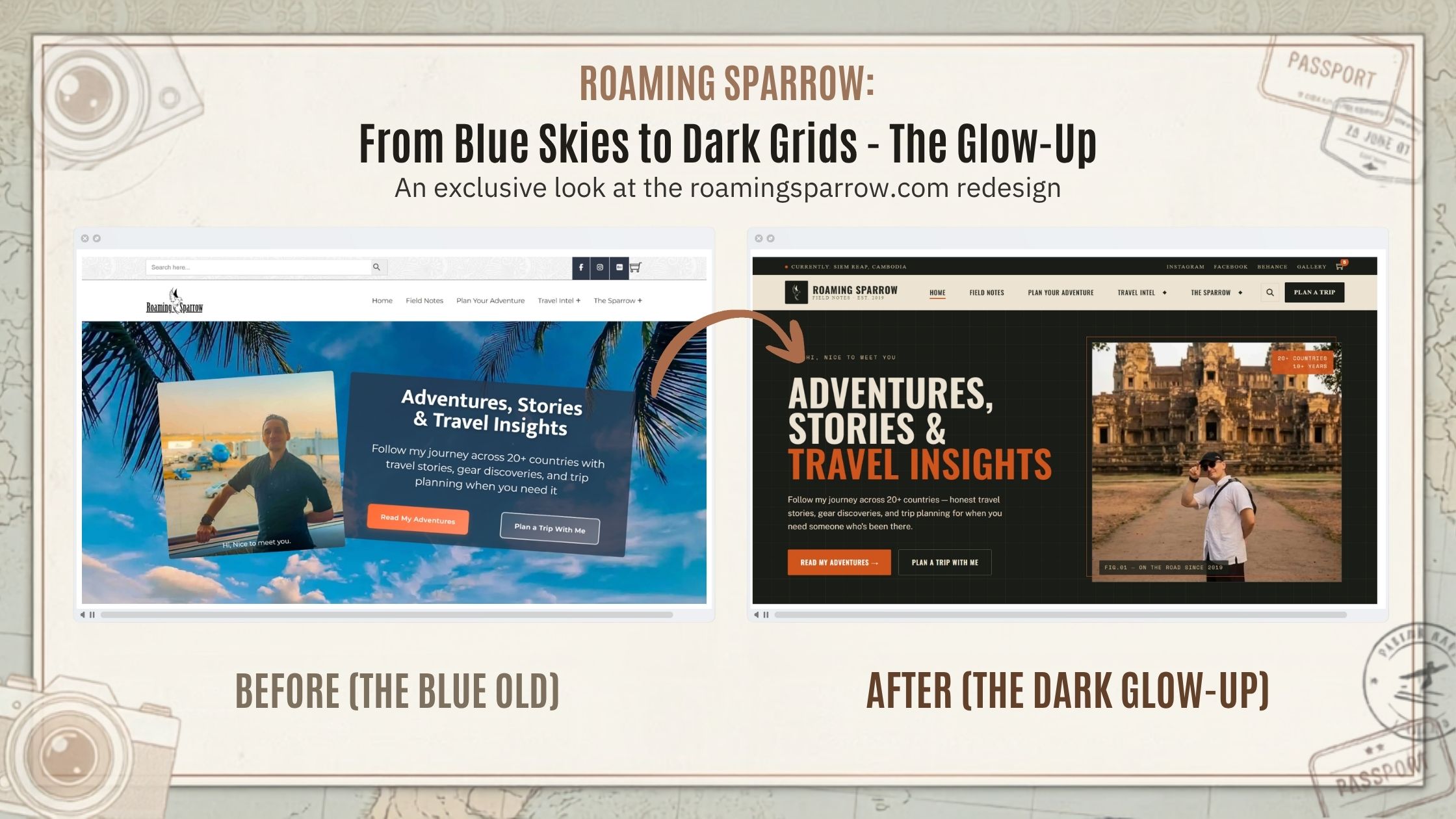
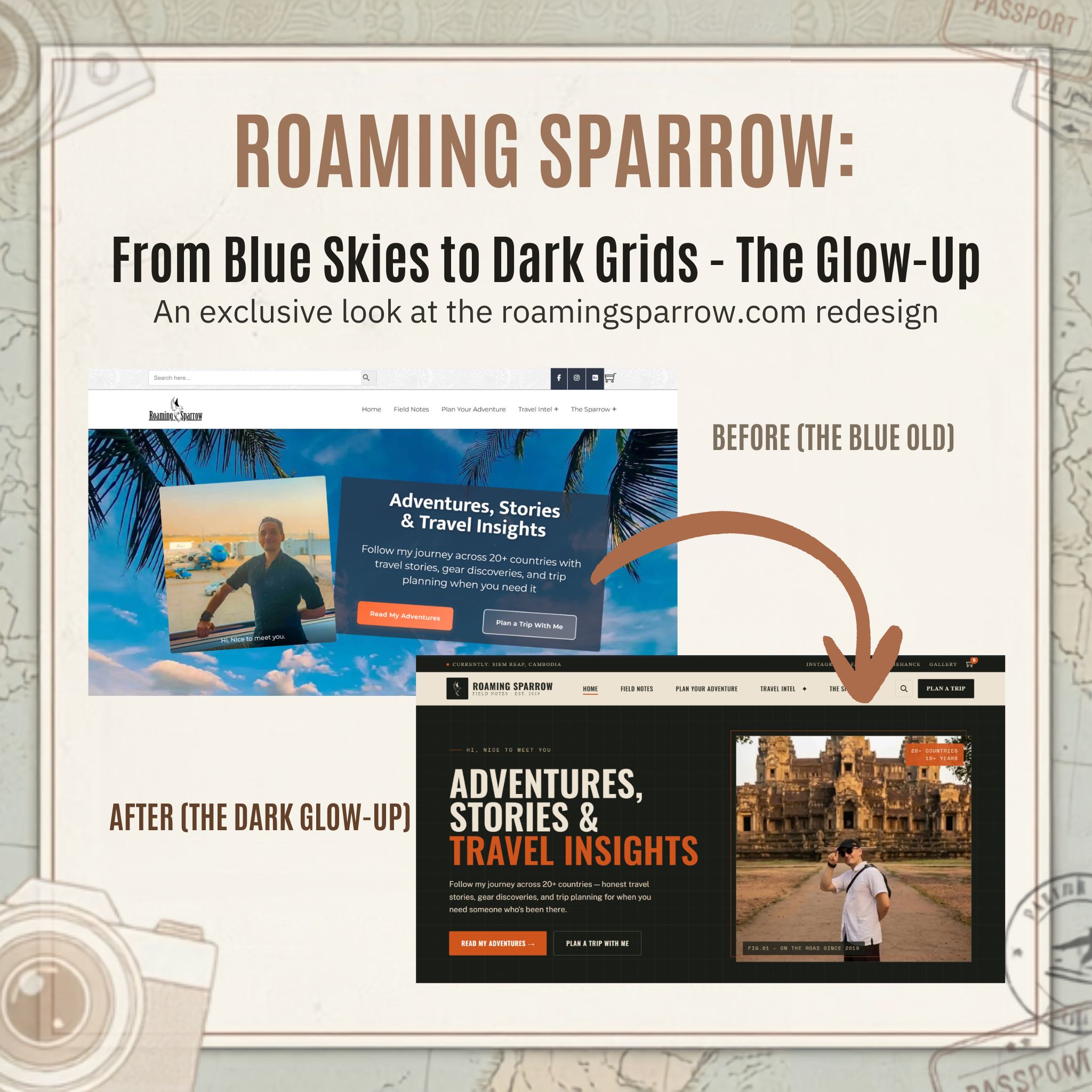
The original wasn’t broken. It was pleasant — a bright tropical hero, a slanted snapshot of me at an airport, a translucent card floating over a blue sky. It looked like a vacation.
That’s the problem. “Looks like a vacation” is the most crowded look in travel. Every blog with a stock palm-tree photo and a cheerful headline reads the same way, and none of them read like someone you’d actually trust to plan a trip. The old design said holiday. I wanted it to say I’ve been there.
The one idea that organized the redesign
So this travel blog redesign organized itself around a single line: stop making a postcard, start making a field notebook. Everything else followed from that.
The bright sky went dark — a warm charcoal ground with sand-colored type and one disciplined burnt-orange accent, instead of a palette competing with itself. The floating glass card, which made the headline fight a busy photo for legibility, became a flat editorial layout where the type leads and the image supports it. And the airport selfie — transit, could-be-anywhere — became a shot at Angkor Wat. Arrival instead of departure, a real place instead of a jet bridge. A small swap that completely changes what the photo is about.
Then the notebook details, which are the part that does the real work:
A metastrip runs across the top — CURRENTLY: SIEM REAP, CAMBODIA — a live dispatch line that signals this is a working log, not a brochure. The hero image is framed like a plate in a journal: FIG.01 — ON THE ROAD SINCE 2019. The logo sits in a tighter lockup with a cleaner sparrow mark and FIELD NOTES · EST. 2019 beneath it.
None of those are decoration. Each one is doing the same single job: convincing you there’s a real person with real mileage behind the site.
The copy got the same treatment. The old subhead offered “trip planning when you need it.” The new one offers “trip planning for when you need someone who’s been there.” Same promise, but the second version sells the thing that actually matters — experience — instead of convenience that anyone can claim. Even the friendly “Hi, nice to meet you” survived; it just moved from a caption on a photo to a structural kicker above the headline, where it sets a tone instead of decorating an image.
Why I ran this travel blog redesign on my own site
Working on my own property meant I could be ruthless in a way client work rarely allows. No one to talk me out of killing the cheerful palm-tree hero they’d grown attached to. No “can we keep the old photo.” Anything that didn’t serve the notebook concept got cut, and the things that stayed all pulled in the same direction.
That discipline — working out what a redesign is for before touching a single pixel — is the part that doesn’t come free with a template or a prompt. The tools can produce a clean, modern hero in seconds. They can’t tell you that modern isn’t the goal, trustworthy is, and then make every element serve that. That’s the judgment call, and it’s the whole job.
Online at : https://roamingsparrow.com/
What’s next, and what it means for your site
The redesign shipped a few days ago, so I don’t have engagement numbers yet — that’s the next phase, watching whether people read further and bounce less now that the site finally matches what it’s for. I’ll update this post when the data’s in.
And if you’re weighing a website redesign of your own — a site that’s fine, pleasant, functional, but reading like everyone else’s in your space — that’s usually not a styling problem. It’s a missing idea about what the site is supposed to be. Working that out is the first thing I’d do with you. The pixels are the easy part.
